Tavernakaya
Rebrand Concept
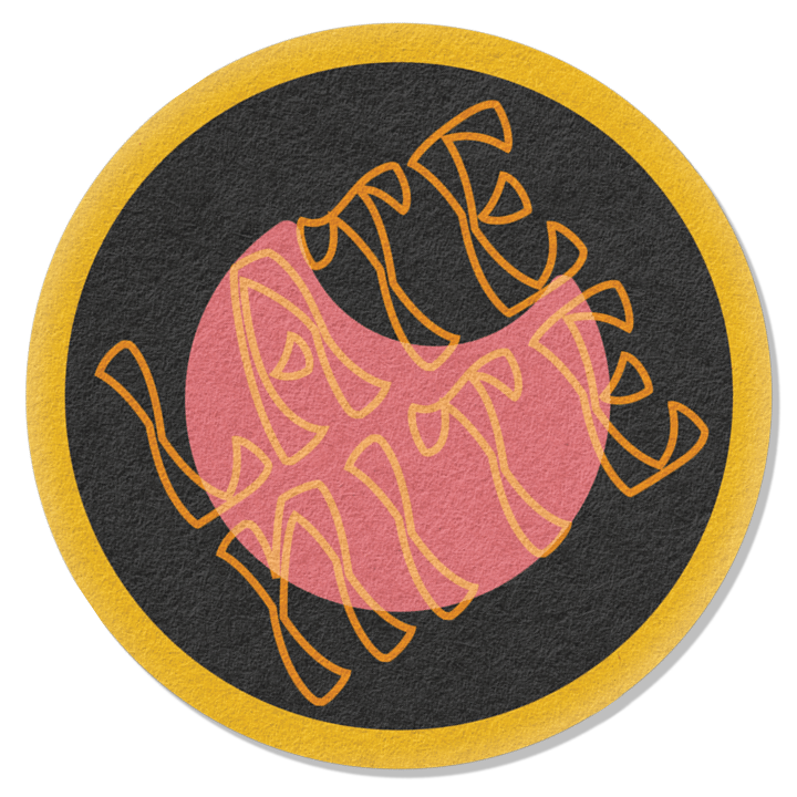
One of my favorite local spots, Tavernakaya felt ripe for a playful rebrand. My work nods to Japan’s old-school minimalist prefecture flags while remaining rooted in Madison iconography.
Tavernakaya strikes a fine balance celebrating Japanese cuisine and acknowledging locals’ insatiable appetite for fried cheese curds. So I took it to heart to maintain that equilibrium in my rebranding experiment.
In an effort not to exoticize the brand, I searched for common aesthetic ground — and found it. Early 20th century prefectural flags are full of simple geometric shapes and bold, bright colors. I could immediately see using the visual language to build marks that felt like Madison.
Some might wonder if TK is too fancy for all this joyful pomp. I say meet me for lunch, and let’s see if we can’t make our server laugh.
Iconography


Menu


Coasters


